Amazon A+ Content: What It Is and How Authors Can Benefit
When you share information online, graphics and color can bring your words to life. Adding images to text can improve a reader’s recall of what you wrote by up to 65%. Most people have a limited attention span for online content, but the right combination of visuals will help you break through and keep them engaged.
The traditional Amazon book page is a bit sparse, aside from the cover art and author photo. With the latest marketing feature from Kindle Direct Publishing (KDP), you can spruce up your book product pages.
Amazon A+ Content adds new formatting modules that let you add visuals, including photos, charts, sidebars, and more. You can plug images and text into these modules for a more creative and engaging look on your book pages.
A+ Content can elevate your product pages and get readers engaged before they even open your book. Here’s how to get started adding content to your own book pages.
What Is Amazon A+ Content?
Amazon A+ Content is a new marketing option for KDP. A+ Content is formatted into modules, and you can customize your book pages with modules by adding images, sidebars, and charts.
A+ Content used to be limited to retailers selling physical objects, but as of July 2021, authors selling books through KDP can take advantage of it, too.
A+ Content appears in the “From the Publisher” section of a page. Readers can see it as they scroll down for more information or to look at reviews.
There’s a lot of flexibility to this marketing tool. For example, many authors choose to post images with snippets of text or taglines written across them. The effect is almost like a mood board, creating an atmosphere around a book. You can mix and match multiple modules for the best effect.
Setting Up A+ Content
To set up A+ Content on your page, you’ll need to sign into your KDP account and visit the marketing tab on the home page.

Choose a Marketplace
Under the A+ Content section, you’ll need to choose your marketplace to get started. “Marketplace” specifies which country’s KDP marketplace you are dealing with, and which language your text should be in.
After you pick a marketplace, click on the “Manage A+ Content” button. That button will take you to a page where you will choose your module type.
Choose a Module
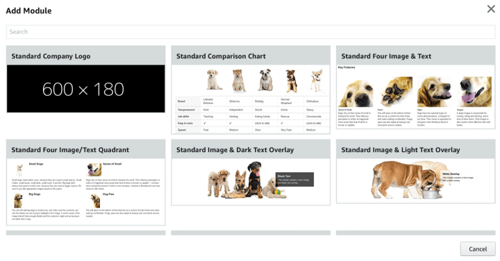
There are 17 modules. The module will provide the format for any images and text you want to include.
Fill Out the Module
From here, you can add the text you want, and the images, if necessary. Amazon requires at least 72 DPI, but they recommend 300 DPI for the best quality.
Add ASINS
Here is where you will add modules to your book pages. You can add the same module to several book pages at once. To add modules to each page, you’ll need to type in your Amazon Standard Identification Number (ASIN), or else you can search for your book by name.
Submit for Approval
Once you finish your A+ Content module and connect it to your book pages, you can submit it for approval. Each module must be approved before it will appear on your page, to make sure no offensive content appears on Amazon. To speed up your approval, familiarize yourself with the content guidelines before you start creating A+ Content.
Modules
There’s a lot of potential and freedom in this new feature, with 17 possible modules to choose from. There is a limit of five modules per page. Children’s author Jessica Collaco has used the maximum number of modules on her book page here, so you can see what that looks like in action.
To get the most impact out of your modules, consider which option will best display the information you have in mind. Do you plan to share information just about your book, or do you want to highlight other books in a series? Each module is suited to different purposes.
Here’s the full list of module options:
- Company logo.
- Comparison chart.
- Four images & text OR three images & text.
- Four image/
text quadrant. - Image & dark text overlay OR light text overlay.
- Image header with text.
- Multiple image module A.
- Single image & highlights OR sidebar OR specs detail.
- Single left image OR right image.
- Technical specifications.
- Product description text.
- Standard texts list.
This list is a little overwhelming, so let’s focus on some of the options that aren’t as self-explanatory as others.
Standard Multiple Image Module A
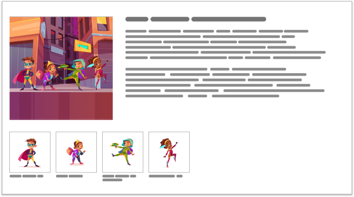
In this module, you can use one main photo with a main description, and four smaller ones with short captions. This is a great way to introduce characters, as shown in the Amazon example above, or highlight different aspects of your book.
Standard Three Images and Text Module
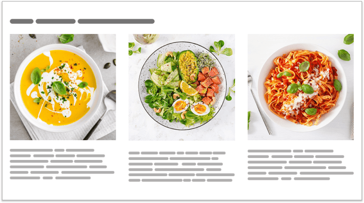
This module lets you share three photos with a brief description under each. It’s fairly flexible, allowing you to show off characters or concepts featured in your book, or even showcasing other related books you have published.
There’s also a version of this module that shows four photos instead of three.
Comparison Chart
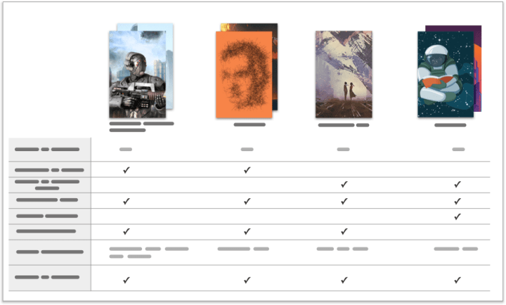
The comparison chart is perfect for a book series. You can add up to six books to each chart, and up to 10 comparison metrics.
You can use this to highlight the best features of your books, or show which characters appear in each book.
Standard Single Image & Sidebar Module
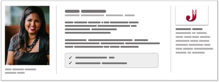
This module can be used to share author info, but it’s versatile enough to be used for other purposes. It creates three different columns on the page so you can introduce several different topics in one section.
There are two other variations on this module available, switching out the sidebar on the right for either product highlights or spec details.
Standard Image & Text Overlay
This module creates a banner-style graphic with a text overlay. This makes a nice header or footer, and is a good way to share short, snappy quotes.

Here’s a great example of how you can combine several of these images to create one continuous graphic, from the book page for On the Way to You by Kandi Steiner:

How Does A+ Content Benefit Authors?
What makes A+ Content so useful? It allows authors to flex their marketing skills and provides a new way to appeal to readers. The modules are versatile enough to use across genres and present the best of your work.
Creative Presentation
The digital marketplace requires you to use visuals and organize information in a user-friendly way. A major benefit of these modules is that they give you plenty of ways to present information without drowning the reader in text. Studies have shown that when people use the internet, they don’t usually read in a linear way like they would when reading a book. Instead, their gaze bounces around the page.
Standard product descriptions feature big blocks of small text without much formatting; they don’t include the headers and images that people are used to seeing online. Modules let you break up the monotony to add colors, lists, and images to your page, increasing the chances that people will read what you have to say.
Highlight Book Features
Another benefit of A+ Content is that you have more space to share information about your book, including snippets or images that evoke a certain feeling.
If readers have any doubts about the genre you’re working in or the plot to expect, A+ Content can banish those, letting you avoid the misunderstandings that could lead to book returns or negative reviews from readers who were expecting something else.
On the other hand, it also helps you connect with readers who want exactly what you mention in your modules. You can highlight certain tropes or themes that might appeal to readers who love your niche, which will drive sales.
The Do’s and Don’ts of A+ Content
Amazon has detailed policies on what content is and isn’t allowed in A+ Content. A quick review of these guidelines should give you a good idea on where to start when you put together modules. If your content is approved, it can take up to eight business days to appear on your page.
These modules are intended to help you show off the best of your work and catch readers’ attention. Amazon’s guidelines recommend including the following:
- Images with a resolution of 72 DPI or more; Amazon recommends resolution of 300 DPI or more
- Images in .jpg or .png format, in RGB colorspace
- Include short quotes or taglines
- A maximum of four quotes from publications, with sources cited
- Mention awards received two years ago or less
Certain content will get your submission rejected. Here’s a list of things to avoid so you can speed up the approval of your A+ Content:
- Mentions of discounts, promotions, or other pricing information
- Customer reviews
- Time-sensitive information
- Blurry, low-resolution photos
- Offensive language
- Personal or business contact information, including to newsletters
- Comparisons with books other than your own
- Links leading to other websites
If you can stick to these guidelines, your submissions will be approved more quickly and you’ll also end up with sleeker, more effective modules.
A+ content gives you the tools to engage with your readers as soon as they’re on your product page. Instead of facing down a wall of text, they’ll see your graphics and book highlights. Take advantage of this feature and try out the module options for yourself!