Designing a Fantastic Author Logo (with examples)
Can you recall the arched trail of a shooting star behind Cinderella’s castle? That’s Disney’s logo: joy, fantasy, creativity, and magic. What if people could instantly recognize your author brand, like they recognize Disney?
Your unique author logo will leave that memorable imprint. A good logo allures and fosters loyalty by embodying your writing’s purpose, vision, mission, and core values. A poorly designed one will make you unremarkable and drive your audience away.
So, read along to ensure that you design an author logo to remember!
Why Do You Need an Author Logo?
From Ex Libris to symbols decorating covers, logos have always existed in the publishing cosmos. A logo can become your stamp or your signature. You can etch it on your book cover, or sign it off for a fan. Logos, while not required, will reap tremendous fruits for your author brand.
If you already have some professional headshots, why bother about a logo? Isn’t your face, some splashes of carefully curated colors, and books enough to leave a memorable mark? Agreed, you should be the face of your author brand, but there are places where your headshot will lose its purpose.
Think of corners like tiny website favicons. You cannot just paste your pretty face there, nor should you leave it deserted. A logo is exactly what you need: something subtle which evokes the right emotions, conveys your story, and instantly paints the picture of your brand. So, why waste time ruminating? Let’s sizzle one for you.
Logo Design Basics
An eye-tracking study found that people spend around 6 seconds focusing on a website’s logo. Given such a small time window, you should showcase a logo that sticks. Here are some basic design tips:
Simplicity
Less is more when it comes to logo design. Logos have to fit in small spaces and still be able to neatly convey your brand. A complex and overly busy logo will distract from the core message. Also, make sure your logo works in black and white. Switching between color and black and white can significantly alter your logo’s feel, especially if it’s over-complicated or over-texturized. Keep. It. Simple.
Context
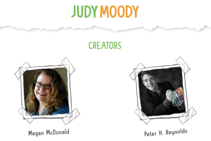
Define your target audience, understand your genre, and keep all the elements in your logo congruent to it. Your logo should embody your niche. A logo out of context will confuse your readers and hinder the connection. Look how Megan McDonald, a children’s book writer, has her logo in a playful font and fun bright colors. One instantly figures out what she writes and who her readers are.
Source: Megan McDonald
Memorability
For a logo to be memorable, it has to be both unique and easy to remember. Avoid overused concepts in your typography and design elements and choose colors wisely. At the same time, beware of losing your brand’s essence in a desperate effort to stand out.
Timelessness
The fewer changes you make to your logo, the stronger your brand will stand the test of time. Avoid trends because they are fleeting. Keep your design evergreen by avoiding seasonal references like a Christmas tree (unless you are sure that you will forever write about Christmas!) You can mix evergreen representations (like quills, books, or ink-pots) with iconic images unique to your brand and niche to create something compelling.
Versatility
Think about how big a logo will be on your book cover, and how small as a website’s favicon. You need a scalable logo that won’t pixelate when zooming in or look unrecognizable when blown out.
To make a scalable logo:
- Be wary of too much detailing. Finer details will look messy at smaller sizes.
- Always use software that lets you design, edit and download vector files. Vector, unlike raster, doesn’t lose quality upon scaling.
Recommended Size Variations
- Wide: Suitable for big placements like website headers.
- Stacked: Suitable for more compact placements like business cards.
- Small: Suitable for tiny placements like website favicons. If necessary, remove some elements from the wide version to create this one, although it’s better if they remain consistent.
Creating Your Logo with Typography
Finding that perfect font is worth the effort. Your font choice can make or break your design. Every font evokes an emotion. The story behind your font should align with your niche and author brand.
Serif
Source: Emma Davies
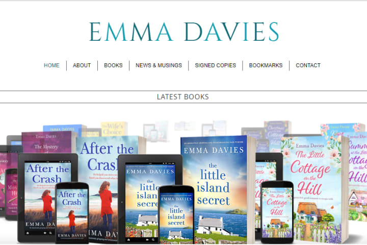
Serif fonts are the ones with tiny strokes or feet at the top and bottom of their letterforms. Vogue, the fashion magazine, features a serif font on its cover page. Garamond and Didot are some other examples. Oldest in age, Serif fonts come across as more formal and classy.
Sans Serif
Source: Brett Battles
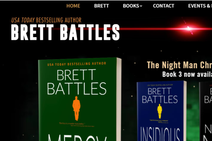
Sans means “without”, and hence sans serif fonts are the ones without those tiny strokes that serif fonts have, such as Futura. Sans serifs are often cleaner, more modern, and more informal.
Script

Source: Jody Hedlund
Script fonts showcase some sort of handwriting or calligraphy. They can be creative and fun, but harder to read. They also range from formal and sophisticated to quirky and childlike.
Display
Source: Austin Kleon
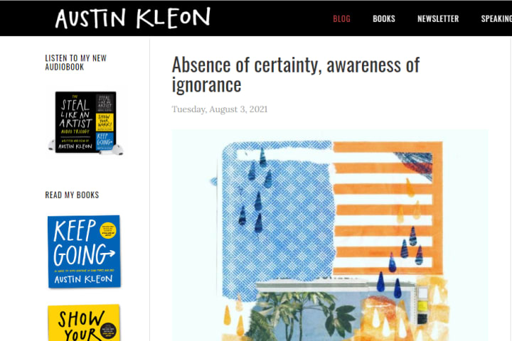
Widely used in custom logos and headings, display fonts are used to convey a specific feeling. Many display fonts are embellished versions of serif, sans serif, and script fonts. They extensively range in styles such as inline, grunge, stencil, etc.
Using your Author Signature

Source: JK Rowling
A logo made using a signature instantly adds a personal touch. Sometimes, your hand-drawn signature will look better than any script font. Look how JK Rowling rocks her home page with her signature logo.
Creating a Visual Logo
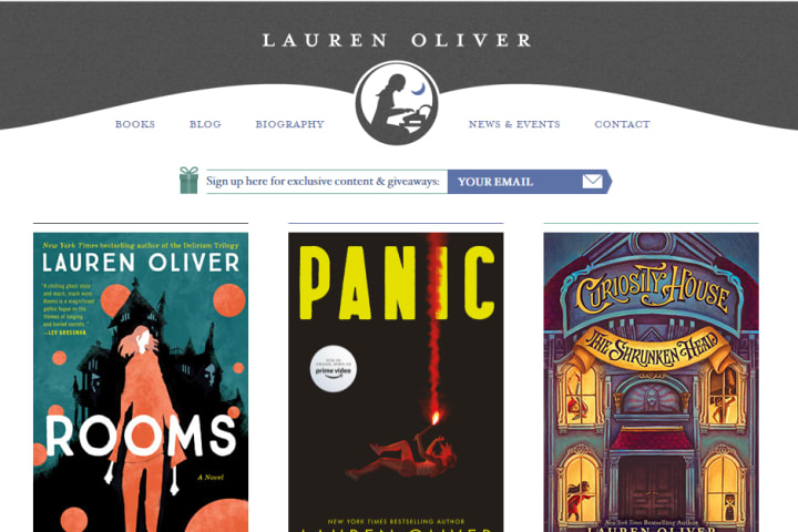
Source: Lauren Oliver
A visual logo features minimal to no typography. Lauren Oliver, for instance, has her logo with a girl, typewriter, and moon. She wisely uses the same logo on her favicon which makes her website appear more cohesive. Consider these points when creating a visual logo:
Grid
Using a grid helps keep the design minimal, clean, and professional. Usually, logos are composed of geometric shapes. Notice how the following floral illustration is composed of overlapping circles. When designing a logo, think geometry. Outline the sketch using shapes like circles, ellipses, rectangles, etc. Use gridlines as a reference to align elements at the desired position.

Golden Ratio

Source: National Geographic
Yes, there’s a magic formula. Leonardo Da Vinci painted the Mona Lisa in the golden ratio. “1: 0.61” roughly is the ratio, and designs in this proportion are naturally appealing to the eye. The rectangle in the National Geographic’s logo has its height and base in this ratio. Nothing is a hard and fast rule, but it’s good to have tried and tested methods in your toolbox.
Psychology of Shapes
Shapes make us feel:
- Squares and rectangles convey stability, reliability, strength, order, and predictability.
- Circles convey unity, harmony, eternity, timelessness.
- Triangles are directional: posited pointing upward, a triangle conveys power, stability, and upward momentum, while pointing downward, they convey instability.
- A bolder line or shape sends out a bolder impression while a thin or curvy shape conveys gentleness.
- Symbols like stars convey messages based on the way you use them, also depending on the demographic, cultural, and individual influences and tastes of your target audience.
Without getting too caught up in the shape game, being a little thoughtful about the shapes will add an intentional personality to your logo.
Psychology of Color
Let the color click! There is much to learn from the color wheel for creating a compelling color palette. Use these bits from color psychology to determine which colors evoke the emotions your brand resonates with. Following are some common associations for each color:
- Red: action, aggression, energy, love, passion
- Orange: creativity, lightheartedness, enthusiasm, youth, fun
- Pink: gratitude, romance, gentleness, innocence, appreciation
- Brown: depth, earthiness, simplicity, seriousness, utility
- Yellow: warmth, positivity, joy, curiosity, playfulness
- Green: freshness, harmony, health, healing, money, nature
- Blue: dignity, confidence, security, serenity, trustworthiness
- Violet: fantasy, mystery, nobility, royalty, sophistication
- White: purity, innocence, perfection, wisdom, spirituality
- Black: authority, class, formality, secrecy, elegance
Tying Your Logo to Your Author Brand

Tell Your Story
Starbucks logo features a Siren, a mysterious twin-tailed mermaid, who is an Italian medieval character, symbolizing the ancient maritime jazz of coffee. This logo went through many revisions, including a version that was so perfectly symmetrical in contrast to the present one which is realistically asymmetrical. Siren’s mysterious dark eyes hook in the audience to want to learn more. Notice how intriguing and on-brand this logo is. There is a ton of content on the internet trying to demystify Starbucks Siren.
Yes, people love a little hint of mystery. As an author, you already are a storyteller. Lure your audience to want to learn more about your logo. Maybe sprinkle some intrigue with one of the characters from your books.
Make your Brand Consistent
Also, with your logo on your display profile, you don’t want to spam someone’s inbox with unnecessary emails or reply disrespectfully on social media. Caught in the act, your audience will be quick to associate your logo, and your brand with adjectives like rude, or apathetic, and you don’t want it. Instead, put your logo on a free give-away, or around a resourceful blog post to make your readers identify your brand as pleasant and in alignment with its core values.
One of the purposes of a logo is to make your brand look similar, cohesive, and hence recognizable across all platforms. Use your logo everywhere you can!
Merchandise
Let your fans flaunt their favorite bookmark with your logo carved on it. Let them support you financially, market your brand, and demonstrate brand loyalty. Create merchandise like journals, posters, T-shirts, etc., and brand it with your logo.
Business Cards
Headshots rarely look good on tiny business cards. Instead, stamp your logo on it. When someone shows interest in your writing, never shy away from handing them your business card.
Website
Putting your logo on your website’s header is a no-brainer, but be sure to put it on your website’s favicon too. A favicon is a small icon that appears on your website’s search tab. It is small, but very potent when it comes to leaving an impression. So, be sure to keep it in your checklist.
Social Media
Yes, you should put your face on your social media profiles. But, you can also brand your social media by putting your logo on your posts. The more people get to see your logo, the more likely they will be to memorize it.
Customize your email’s header by putting your logo on it. Craft emails that are resourceful, captivating, and helpful. Seeing your logo above a heartfelt piece of content will make your audience memorize your logo as a trustworthy symbol.
Working with a Professional Designer
Set Guidelines
Somewhere in the hustle of communicating your expectations, important information can get lost in the long email threads, text messages, or phone calls. Take control, avoid such mishaps, and prepare a document to be handed to your designer with the following sections:
- Briefly write about who you are, what you write about, and who your target audience is. Share links to your website, books, etc.
- Write a brief about your vision of the logo. Share links to examples that inspired your concept.
- Enlist all the color codes from your color palette, names of existing fonts you use, or anything else which represents your visual style. Reflect on your branding. Express how flexible your branding is at this stage. Answer questions like: Are you open to adding new colors to your color palette?
- Lay down your expectations in advance, regarding the design, revisions, and other aspects of the designing experience that you feel are important to address.
- Express what it is that you don’t want in your design. Share links to examples, e.g. you don’t want a certain family of fonts in your design.
- Make a list of all the places your logo will be used.
Provide Feedback
Encourage communication. Set milestones with your designer so you can share your feedback without clogging the designer’s creative freedom with too many rules.
Be Patient
Amazing logos don’t just happen overnight. Designing is a skill that takes years of experience. Your designer might fail to capture your vision in the first go. Be patient, collaborative, and respectful.
Resources for a DIY Logo
Even if you’re not much of a designer, you may craft a functional and nice-looking logo on your own. Doing it yourself is easier than ever. There are plenty of tools, resources, and software to launch your logo designing project off the ground.
Learning
Level up your designing skills with Youtube channels like Satori Graphics and Dansky. Skillshare is another option with recorded classes geared towards creative skill sets, is affordable, and also has a free trial. Here’s a helpful Skillshare class: “The golden ratio in logo design” by Lindsay Marsh.
Designing
Canva is an easy-to-use, drag-and-drop designing software with ready-to-use templates. You can design and download raster files for free, but to download a vector graphic, a Canva premium subscription is required. Canva also offers a free premium trial. Other beginner-friendly options are Designhill, Themeisle, and Looka.
Typography
Google Fonts is an open-source library that lets you download fonts for free of cost. It also allows you to search for a font by category like serif, handwriting, etc. DaFont is another option. Free Script Font is a good option for finding script fonts for a calligraphic logo.
A logo will accompany you in your author career, in the long run, helping your author brand to thrive as an authority in your niche. Designing a logo is an investment worth the effort, and your brand deserves a fantastic logo. With all that you have learned, you are ready to kick-start designing. Begin with crafting your vision board, collecting ideas, and figuring out what clicks for your brand. Good luck!