How to Choose the Perfect Author Fonts
Looking at cover designs is half the fun of browsing a bookstore. Cover art might be the first thing that catches your eye, but what do you notice next? The fonts used probably give you some important information about the book, like the genre and tone.
Authors may spend hours searching for the perfect way to end a sentence or explain a concept. The font used for your writing is just one more factor that affects how readers absorb your words. The right font will flow effortlessly, but a bad font choice distracts readers and contradicts the text’s tone.
Some fonts are so iconic, they stay with an author’s branding for years. Stephen King used variations on the famous ITC Benguiat throughout the 1980s, and it graced the covers of It, Cujo, and Misery. Danielle Steele’s signature cover font has changed a few times throughout her decades-long career, but she stuck with one of them for 13 years.
Learning about fonts is essential for any author to make better branding decisions and make all your projects shine. It’s definitely worth your time! In this article, we go over different font types, how to use them, and where to find them.
Fonts 101
A font is a standardized set of letters with a shared style, thickness, and spacing. Every character will have a consistent styling each time it is typed.
The style of a font is called a typeface, and there are often typeface families with variations in boldness or lightness. For example, Arial Light is a font with a lighter weight than standard Arial. Typefaces date back to the invention of the printing press.
There are many types of fonts and many different styles, allowing for lots of creative variation. You can find a font for almost any theme, and the selection is only increasing as designers create and upload new ones every day.
Kinds of Fonts
The main font categories are serif, sans-serif, script, and decorative.
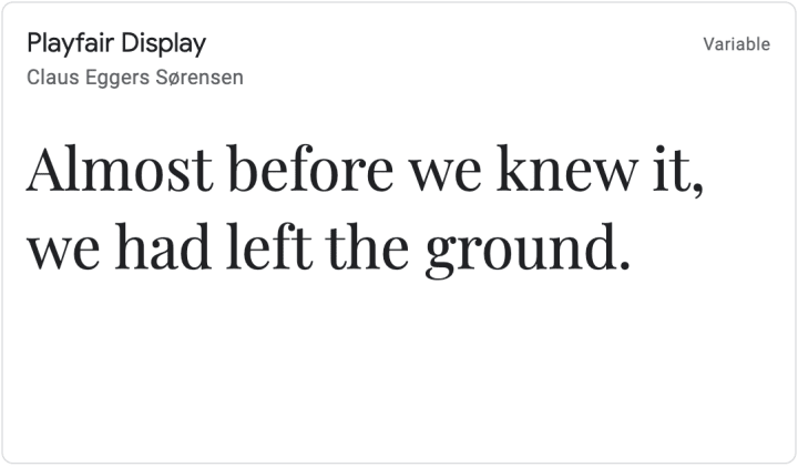
A serif is a tiny stroke that appears at the ends of each letter, adding a flourish. Serif fonts have those strokes, at the ends of each letter. These fonts tend to have a more traditional, intricate look. They are often found in print media, like the interior of books and magazines. Times New Roman is one of the most popular examples of this font, and most people have used it for school or work.

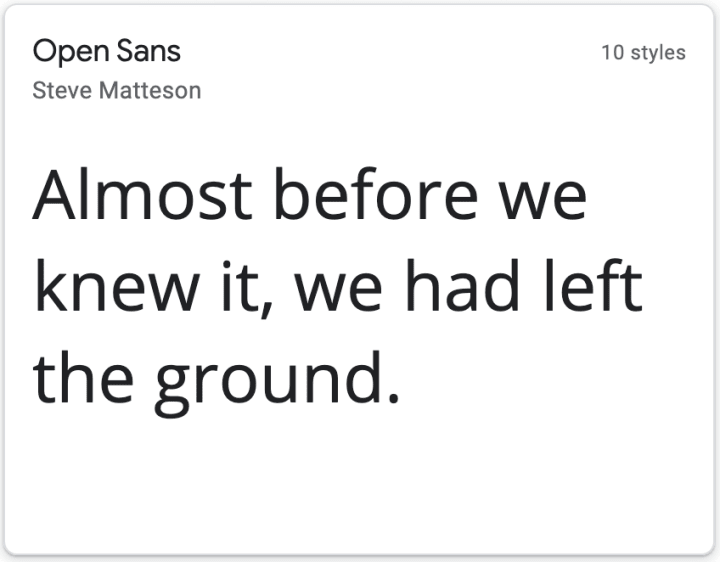
Sans-serif fonts don’t have these lines, and they have a smooth, straight visual instead. This kind of font is especially common on the internet. The most famous sans-serif is Helvetica, a font that has appeared everywhere from the American Apparel logo to the New York City subway system.

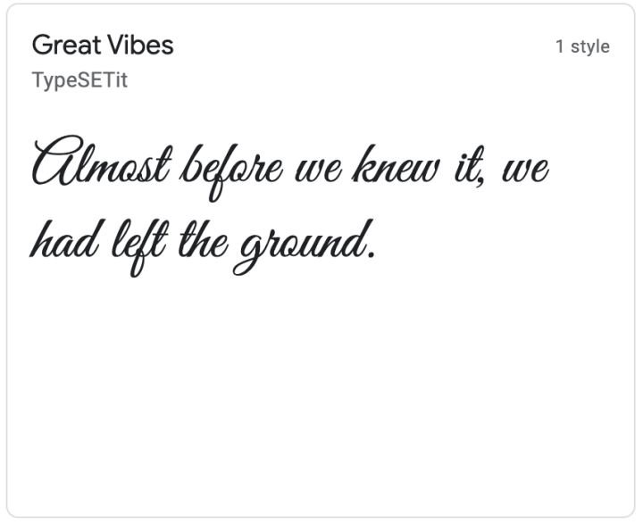
Script fonts are styled to look like handwriting, with jointed letters. This font category is a more recent invention than the others, and is generally used for shorter blocks of text because it isn’t as easy to read as a serif or sans-serif.

Decorative fonts, also known as display fonts, are the most varied category. They are designed for use in headings and titles, rather than text bodies. Many of these fonts are elaborate and stylized, like the example below.

Why Do Fonts Matter?
The content of your words is the focus of any writing, but the right font choice can make those words even more powerful. After years of exposure to media, we learn to interpret visual cues. Many fonts or font styles have associations.
When choosing fonts for your author brand, try to use specific visual language that tells people the kind of work you do, and draws the right kind of readers to your work. You can use them to establish your work’s genre before a reader even opens the book! Your choices will also show your reader your authority and trustworthiness.
For example, a toy store might use a silly, memorable font that attracts children, while a tax preparation company will probably use a classic font that makes them look reliable. The visual impact of words sink in before the meaning does, and fonts get readers in the right mindset.
Fonts can help you fulfill your creative vision for your books, branding, and promotional materials as well. They will aid you create a strong cohesion between what’s inside and outside your books, and that makes them extremely valuable as a marketing tool.
How to Choose the Perfect Font
Fonts help establish a tone and style to your words. The visual of a font registers even before a person starts reading. Some styles will be more effective for your purposes than others, though. With seemingly endless options available online, how do you decide?
Readability
Readability is a key factor when choosing a font. People are likely to stop reading if the text is hard to read or overly elaborate. Some options are easier on the eyes than others. If you’re planning to have large blocks of writing in a particular font, it’s a good idea to choose a classic option free of flourishes and distractions. Decorative fonts should be used sparingly, for for short lines of text like titles or author logos.
The website Genuisee did a roundup of several studies on fonts and readability. Based on those studies, they came to the conclusion that sans-serifs have a slight edge over serif fonts when it comes to readability, particularly for people with reading difficulties.
Serif fonts are the most common choice for printed text, in part because designers often say that the serifs make words easier to read on the page. The idea is that the serifs lead you from one letter into another. Sans-serifs, on the other hand, have become the standard for online text. The straight lines of sans-serifs show up clearly on screens.
Branding
You should consider your book’s genre as a way to narrow your search for fonts. For example, slick, bold fonts are perfect for fast-paced thriller novels, while elegant script fonts are so closely associated with romance. Readers will always pick up on the connection in a glance. Lots of font libraries are searchable by theme, style, and type of font, so it’s easier and faster to find a suitable option.
As an author, you operate on multiple platforms. The font you choose will vary depending on what you are creating. There are opportunities to boost your author brand through typography on social media posts, your website, and of course, your book itself. Here are some considerations to keep in mind.
Book Covers
On book covers, the two most important pieces of text are the title and author name. Lots of book covers use a few different fonts for these texts. This is your chance to use splashy, memorable fonts. Titles tend to be short, so there’s less concern about straining your readers’ eyes.
When pairing fonts together, look for combinations that offer a pleasant contrast. Try mixing a serif with a sans-serif, or a light font with a bold, heavy one. If you’re worried about clashing, avoid using multiple flourishy fonts and try using variations of the same. It’s best to limit yourself to two families only, because too many choices can look distracting, poorly planned, and messy.
Try to highlight the genre and tone of your book with fonts whenever possible. A good font will boost the overall cover design and show the genre or style of book readers should expect.
Book Interiors
Authors who self-publish have control over every aspect of their books, including the interior font. Readers will spend a lot of time with this font, so readability is the top priority. The most popular interior fonts are Garamond, Baskerville, Caslon, and Montserrat.
Publishing houses and independent writers alike tend to stick to tradition for a book’s interior. For fiction books, serif fonts are more traditional, but some nonfiction authors use sans-serifs to give their manuscripts a simple, modern appeal.
Author Logo
Author logos should be memorable and creative. Whether you use your full author name or a shortened version of it, this is an opportunity to use a decorative font that will stand out to readers. Try using something that reflects your genre and author persona at a glance. You may also want to experiment with custom fonts or hand lettering to add a more personal feel.
Website and Online Presence
Your author website is where you can establish your persona and share information about your work, especially with people who haven’t encountered you before. Most websites use a combination of fonts, based on their specific purpose on the page.
The website header might include a decorative, eye-catching font, or your logo. For longer blocks of text like blog posts or your author biography, use a standard, highly readable font. Readable doesn’t mean boring! There’s always a chance of bringing forward your genre and personality. For example, a serif with slightly more decorative serifs might add a touch of historical fiction flair.
Between social media, newsletters, and your author website, it’s possible to get bogged down by all the possible fonts you could use. It’s helpful to keep some consistency between all your online platforms, both for creating a stronger author branding and to make things easier for yourself.
Paid Advertising
When you’re posting ads and other promo images, fonts are a great way to add style and personality. But your space is often quite limited, and some fonts become hard (or impossible) to read when downsized. That’s the opposite you want to achieve on an ad! Again, in this case readability is key, but you can always spice things up with a headline that showcases a more eye-catching font.
Author Swag
Swag gives you another opportunity to showcase your font choices. There should be consistency in your typography, and physical objects you share, such as business cards or bookmarks, are no exception. Instead of picking a brand-new font for any new items, you should tie them in with your brand by using a familiar font from your book covers, website, or author logo. Remember, a consistent brand reinforces itself.
Serif fonts are a popular option for any printed items, due to tradition and the belief that they are easier to read on paper than sans-serif fonts. But feel free to have more fun and use decorative fonts for any swag that you want to design as a fashion item, such as t-shirts or tote bags.
Where to Find Fonts
Lots of designers put their skills to work by designing fonts, and there are thousands available online. Some fonts are free for personal and commercial use, but others require you to buy a license to use them for commercial purposes. It’s important to make sure the font you choose falls into the right category. If you choose a free font, make sure it is specified as open source, which gives you the right to use it commercially. These websites have thousands of fonts that are free to use:
Honorable mention goes to Typewolf, a great website for learning about fonts and typography. Not all of their content is free, but they have plenty of information if you want to do a deep dive into this subject.
Armed with the basics and some starting resources, you can find the perfect font for any project, whether you’re working on your author website or a new book. Font inspiration is everywhere from book covers to bags of chips, ready to spark your creativity. With knowledge and motivation, you’ll be able to update your brand with new fonts that capture your essence as a writer.